
Echarts是一个丰富的图表库,几乎可以满足任何图表样式。
下面我演示一个图表示例。
import React from "react";
import "./ProjectDetailPanelLint.css";
import PanelTitle from "./PanelTitle";
import ReactEcharts from "echarts-for-react";
class ProjectDetailPanelCICD extends React.Component {
rightFunc = () => {
}
getOption() {
return {
title: {
text: "",
show: false,
// text: "图表测试"
},
legend: {
data: ["销量"],
// data: [{ name: 'T1探头', icon: 'rect' }, { name: 'T2探头' }],
top: '5%', //距上边距 还有属性为 距下边距 距左边距 距右边距
orient: 'vertical',//竖直对齐
textStyle: {//图例文字的样式
color: 'white'
},
},
xAxis: {
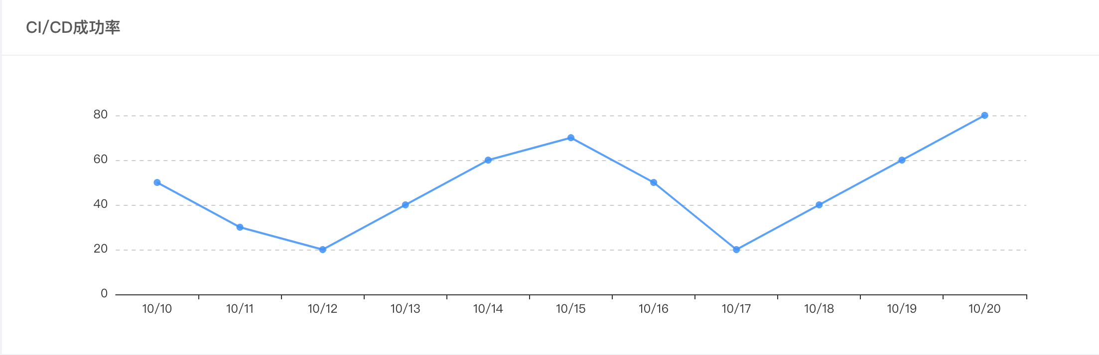
data: ["10/10", "10/11", "10/12", "10/13", "10/14", "10/15", "10/16", "10/17", "10/18", "10/19", "10/20"]
},
yAxis: {
splitLine: {
show: true,
lineStyle: {
type: 'dashed'
}
},
axisLine: {
show: false,
},
axisTick: {
show: false,
}
},
series: [{
name: "数量",
type: "line",
data: [50, 30, 20, 40, 60, 70, 50, 20, 40, 60, 80],
itemStyle: {
normal: {
lineStyle: {
width: 2, //调整 线条的宽度 5已经很宽啦
color: "rgba(24,144,255,0.85)" //线条颜色
},
color: "rgba(24,144,255,0.85)", //折线拐点的颜色
},
},
// smooth: true,//是否平滑过渡
showSymbol: true,
symbol: 'circle', //设定为实心点
symbolSize: 7, //设定实心点的大小
hoverAnimation: true,
animation: false,
}],
tooltip: {
show: true,
trigger: 'axis',
axisPointer: {
type: "none",
snap: true,
},
//show: true, //default true
showDelay: 0,//显示延时,添加显示延时可以避免频繁切换
hideDelay: 50,//隐藏延时
transitionDuration: 0,//动画变换时长
// backgroundColor: 'rgba(0,0,0,0.7)',//背景颜色(此时为默认色)
backgroundColor: '#fff',//背景颜色(此时为默认色)
textStyle: {//图例文字的样式
color: '#666666'
},
extraCssText: 'box-shadow: 0 0 5px rgba(0, 0, 0, 0.3);',//悬浮窗阴影
borderRadius: 4,//边框圆角
padding: [5, 10], // [5, 10, 15, 20] 内边距
position: function (p: any) {
// 位置回调
// console.log && console.log(p);
return [p[0] + 10, p[1] - 10];
},
},
}
}
render() {
return (
<div className="pd-panel-lint-main">
<div className="pd-panel-lint-title">
<PanelTitle
titleLeft="CI/CD成功率"
titleCentter=""
titleRight=""
rightFunc={this.rightFunc}
/>
</div>
<div className="pd-panel-lint-content">
<ReactEcharts
option={this.getOption()}
notMerge={true}
lazyUpdate={true}
opts={{ renderer: 'svg' }} className="pd-panel-lint-chart" />
</div>
</div >
);
}
}
export default ProjectDetailPanelCICD;基本上根据示例代码注释就能明白含义。
效果如下图:
如果想把折线图改成条形图,需将getOption()的series修改为:
series: [{
   type: "bar",
}]
效果如下图:

Hi,我最近也在使用React + Antd + Echarts 来作为项目的基础架构,但是在引入地图时出现了问题。
因为使用的是TypeScript,但是Echarts中带有的China.js是js版本的,所以我该如何使用这个js呢?
万份感谢。
我已经写出来了,具体如下:
declare module "echarts/map/js/china";
import "echarts/map/js/china";
不太懂前端...